Mastering the Art of Compelling Data Visualization: Strategies for Maximum Impact
In the age of information overload, data visualization has emerged as a powerful tool to convey complex information in a concise and understandable manner. From charts and graphs to interactive dashboards, effective data visualizations have the ability to transform raw data into actionable insights. In this article, we will explore the principles and techniques behind creating impactful data visualizations that not only captivate the audience but also facilitate informed decision-making.
The Power of Visual Representation
Humans are inherently visual beings, and our brains process visual information much faster than text or numbers alone. Data visualizations leverage this innate cognitive ability, making it easier for individuals to grasp trends, patterns, and relationships within data sets. When executed well, data visualizations can transcend language barriers and simplify complex concepts, allowing for more effective communication and collaboration across various domains. As the acclaimed data journalist and designer, David McCandless famously put it, “Information is beautiful, and data visualization is its composer.” Through innovative data-visualization approaches, we can orchestrate the symphony of understanding, transforming intricate data into captivating visual narratives.
Key Principles of Effective Data Visualizations
In the realm of data-driven communication, the art of creating effective visualizations hinges on a set of fundamental principles that transcend the boundaries of fields and disciplines.
- 1. Clarity and Simplicity: The fundamental principle of data visualization is clarity. A cluttered or confusing visualization can obscure the intended message. Keep the design simple and remove unnecessary elements that may distract from the main insights.
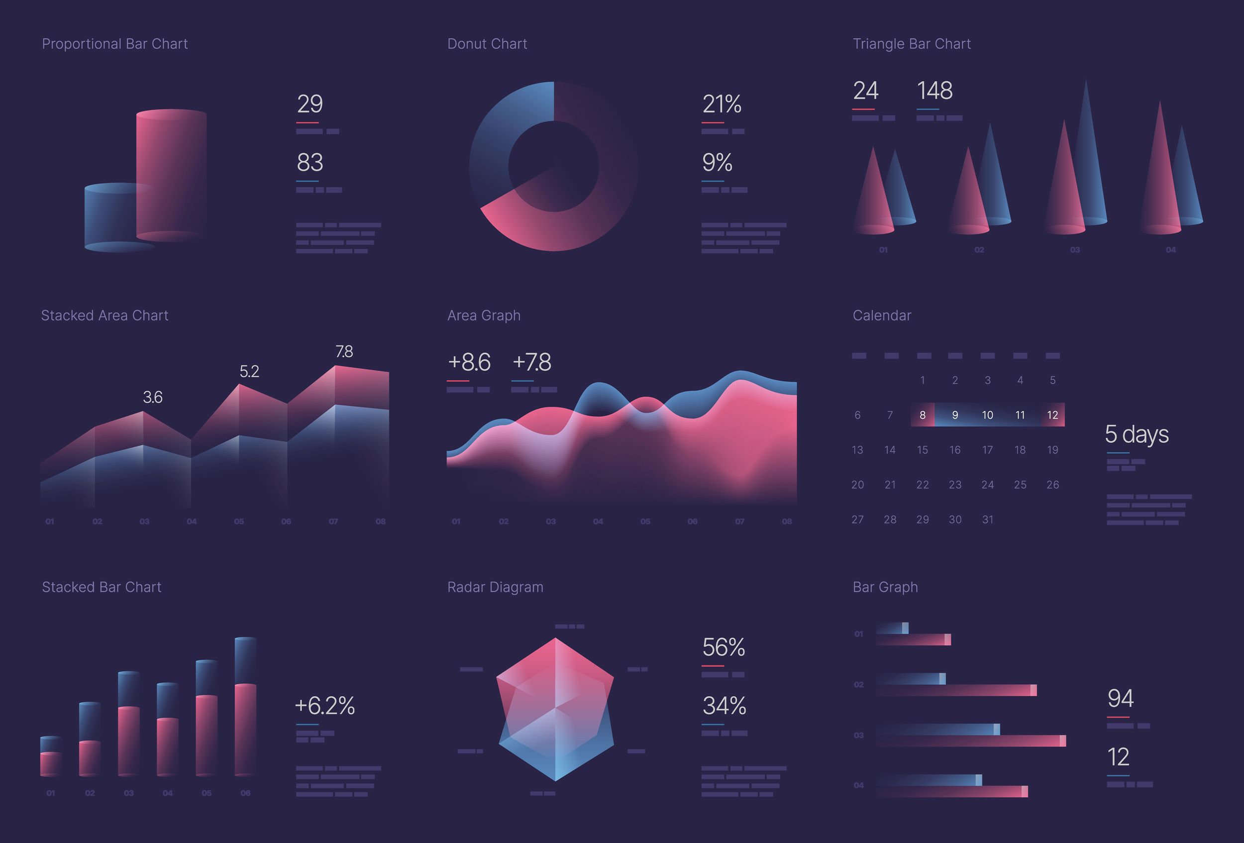
- 2. Relevance: Choose the right type of visualization that best represents the data and supports the message you want to convey. Bar charts, line graphs, scatter plots, and heat maps each have their own strengths and weaknesses, so select the most appropriate format for your data.
- 3. Accuracy: Accurate representation of data is crucial. Avoid distorting or exaggerating information, as it can lead to misinterpretation and erroneous conclusions. Clearly label axes, provide appropriate context, and cite your data sources.
- 4. Consistency: Maintain a consistent style throughout your visualizations to create a cohesive and unified presentation. Consistency in color schemes, typography, and labeling helps your audience understand and navigate your visualizations more easily.
- 5. Interactivity: Interactive elements in data visualizations allow users to explore and manipulate the data, enhancing their engagement and understanding. However, ensure that interactivity enhances the experience rather than complicating it.
Designing for Impact
The best designs shape data into a compelling narrative that balances aesthetics and functionality. Each stroke of color, choice of font, and element’s placement carries the potential to convey insights that linger long after the visualization fades. The following are some important aspects of impactful designs:
- 1. Choosing the Right Data: Not all data is suitable for visualization. Start with a clear question or objective, and then gather and preprocess data that directly addresses that question.
- 2. Storytelling: Transform data into a narrative that guides the viewer through the insights. Craft a compelling storyline that highlights trends, anomalies, and correlations within the data.
- 3. Color and Typography: Use color strategically to highlight key data points and relationships. Avoid excessive use of color, which can create confusion. Similarly, choose typography that enhances readability and maintains a professional appearance.
- 4. Hierarchy and Emphasis: Create a visual hierarchy that guides the viewer’s attention to the most important elements. Use size, position, and emphasis to highlight critical data points.
- 5. Aesthetics vs. Functionality: Balance between aesthetics and functionality. While aesthetics can make visualizations engaging, prioritize clarity and functionality to ensure the message is effectively communicated.
Tools and Technologies
From dynamic dashboards that invite interaction to coding libraries that offer boundless customization, the arsenal of options empowers creators to craft visualizations that transcend mere information and evolve into compelling stories. Some frequently used tools and technologies for data visualization are as follows:
- 1. Data Visualization Software: Explore popular data visualization tools such as Tableau, Power BI, and D3.js. These tools offer a range of features to create static and interactive visualizations.
- 2. Coding Libraries: For those comfortable with programming, libraries such as Matplotlib (Python) and ggplot2 (R) provide flexibility in creating customized data visualizations.
- 3. Interactive Dashboards: Create dynamic dashboards using tools such as Tableau or Power BI to allow users to explore data on their terms.
Ethical Considerations
Ethical considerations in data visualization act as the compass that ensures our creations not only enlighten but also respect the boundaries of responsibility. Some crucial ethical aspects in data visualization are as follows:
- 1. Avoid Misrepresentation: Ensure that data visualizations accurately represent the underlying data, avoiding any misleading or deceptive practices.
- 2. Accessibility: Design visualizations with accessibility in mind. Provide alternative text, consider colorblindness, and ensure compatibility with screen readers.
- 3. Privacy and Security: When working with sensitive data, take appropriate measures to protect individuals’ privacy and adhere to data security protocols.
Effective data visualizations have the potential to bridge the gap between raw data and meaningful insights, fostering informed decision-making and driving positive outcomes. By adhering to principles of clarity, relevance, accuracy, consistency, and interactivity, designers and analysts can create visualizations that not only captivate audiences but also empower them to navigate the complexities of the modern data landscape. With the right tools and ethical considerations, data visualizations can become valuable instruments for unlocking the true potential of data-driven decision-making.